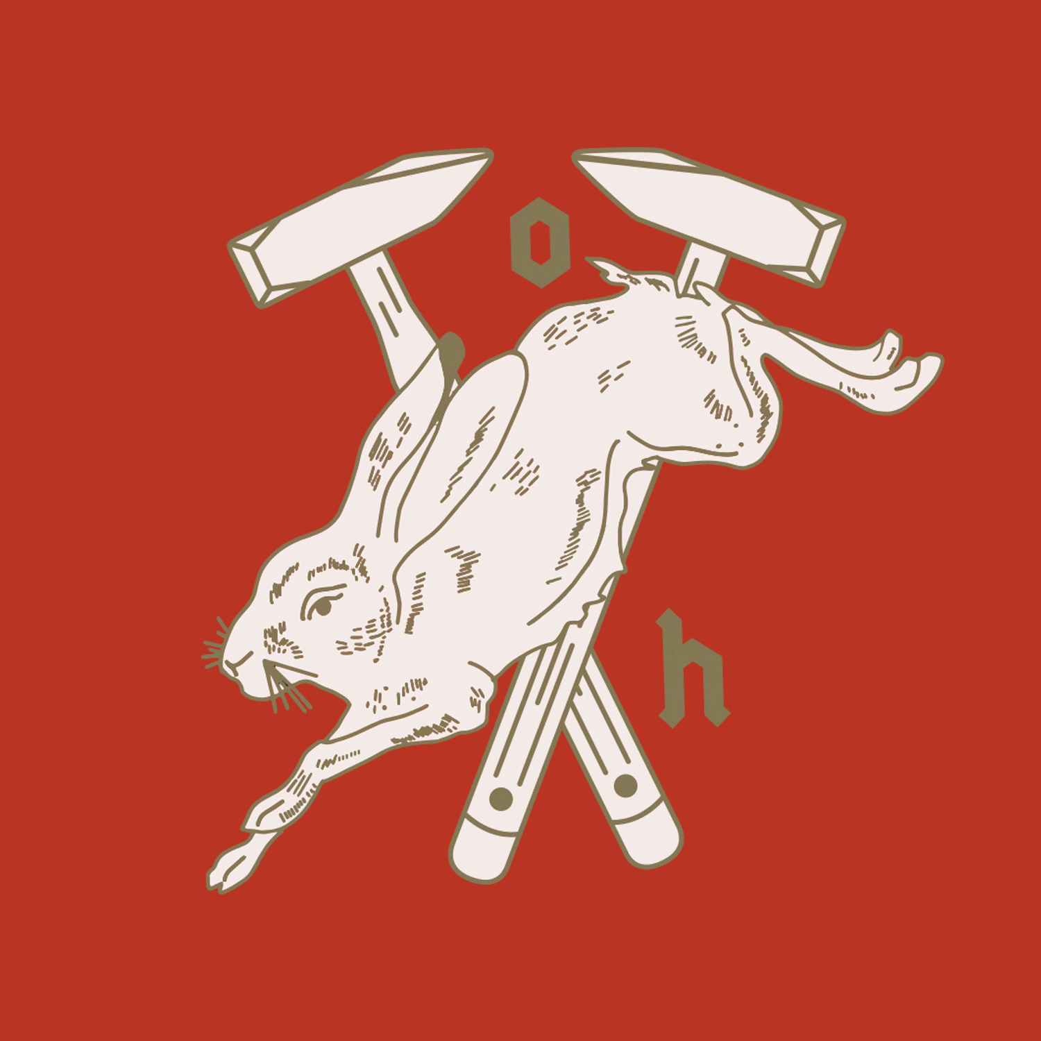
PROJECT NAME
OBSIDIAN HOMES LTD.
[ Brand Identity | Logo Design | Illustration ]
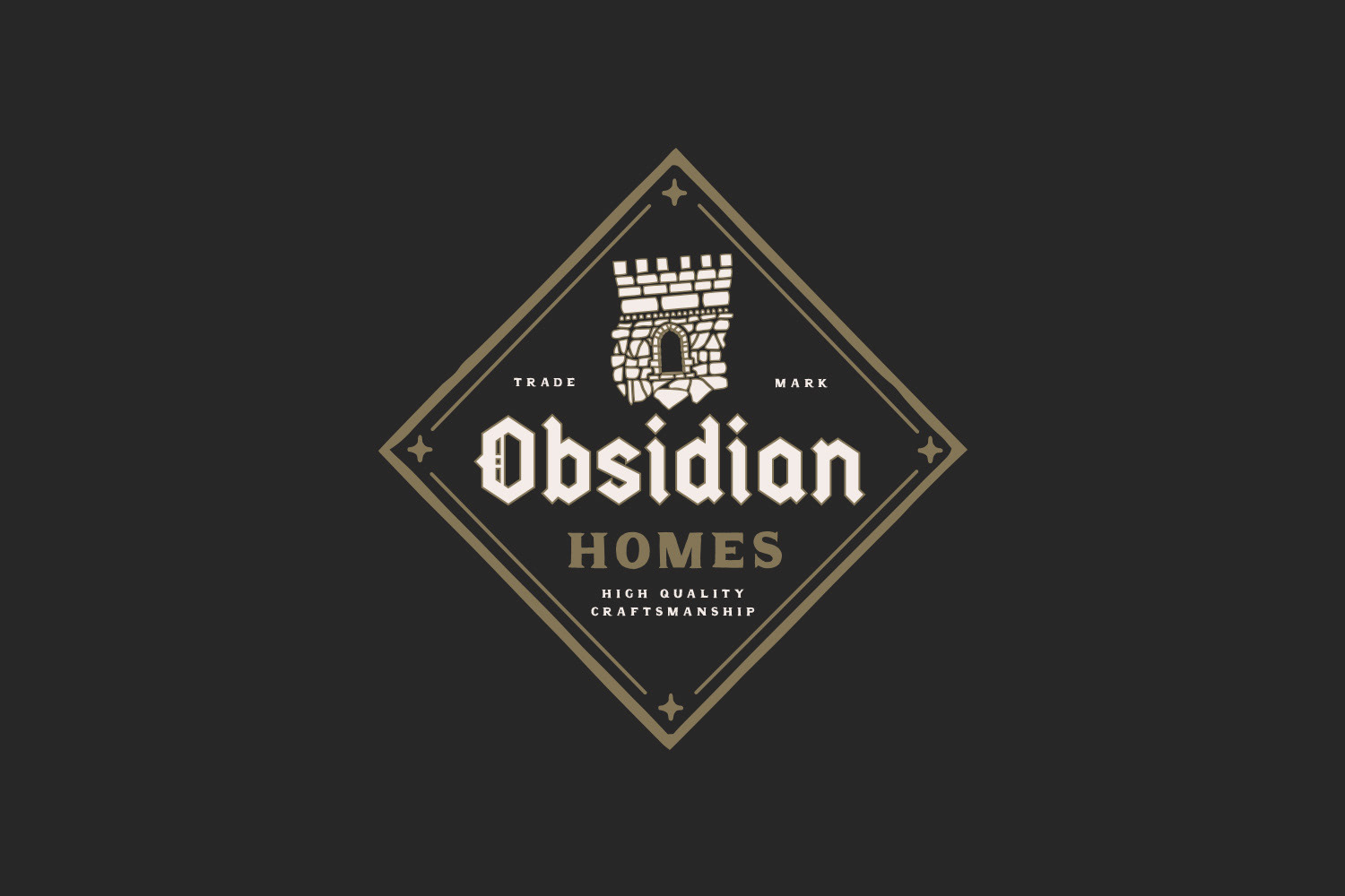
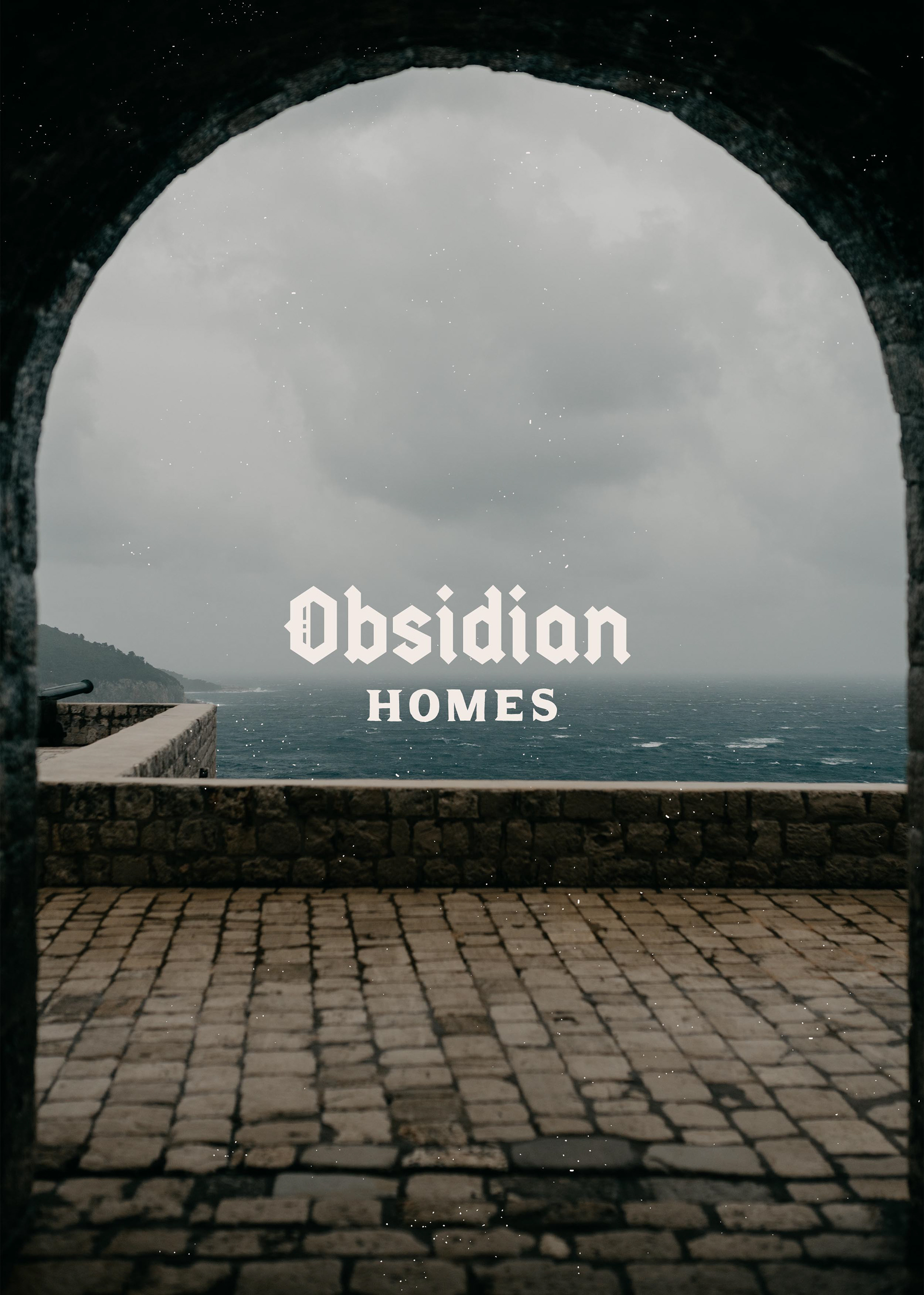
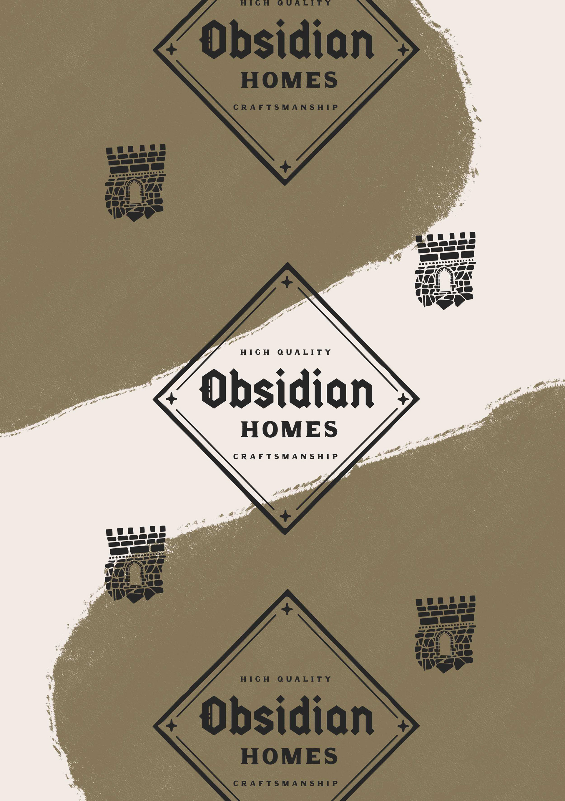
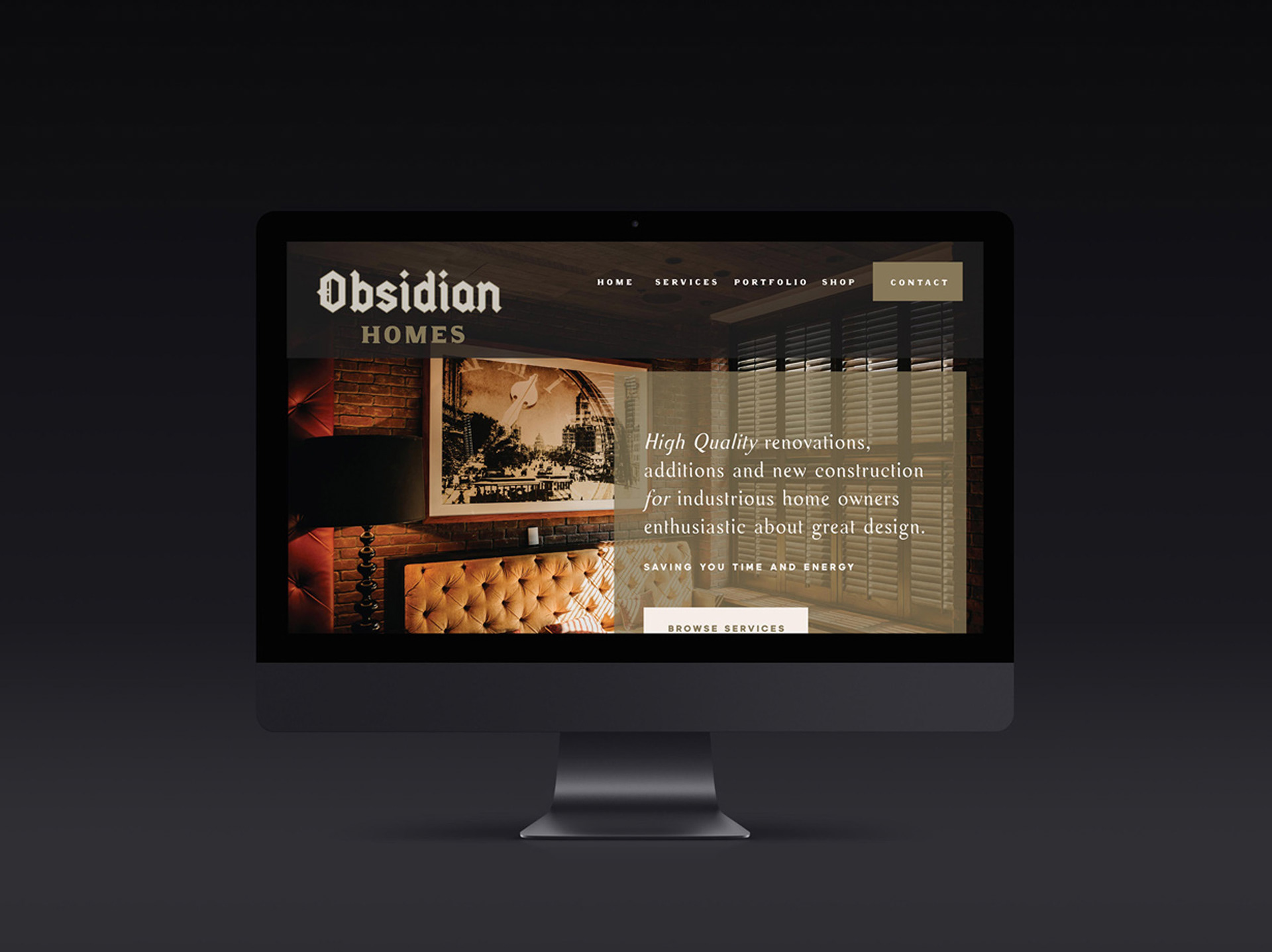
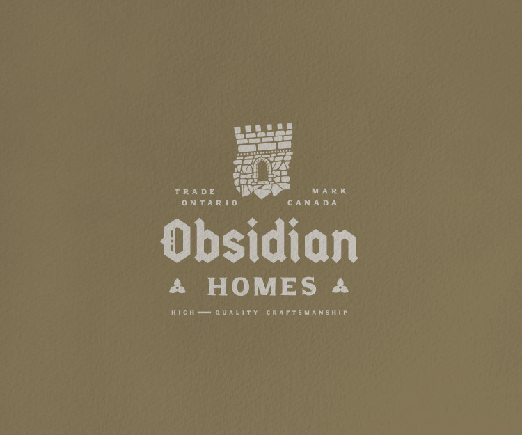
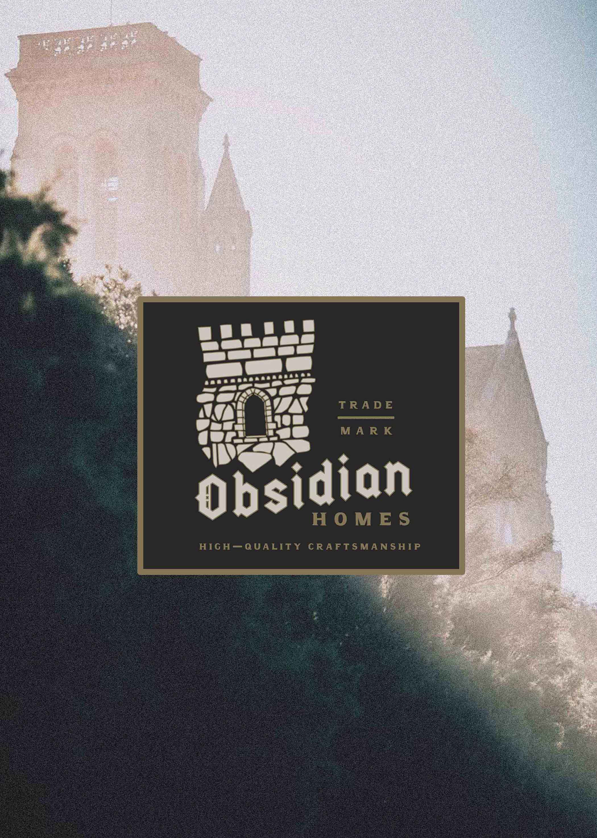
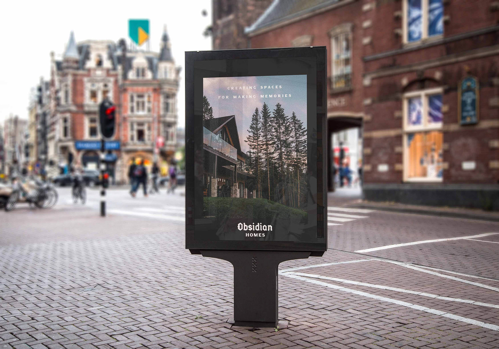
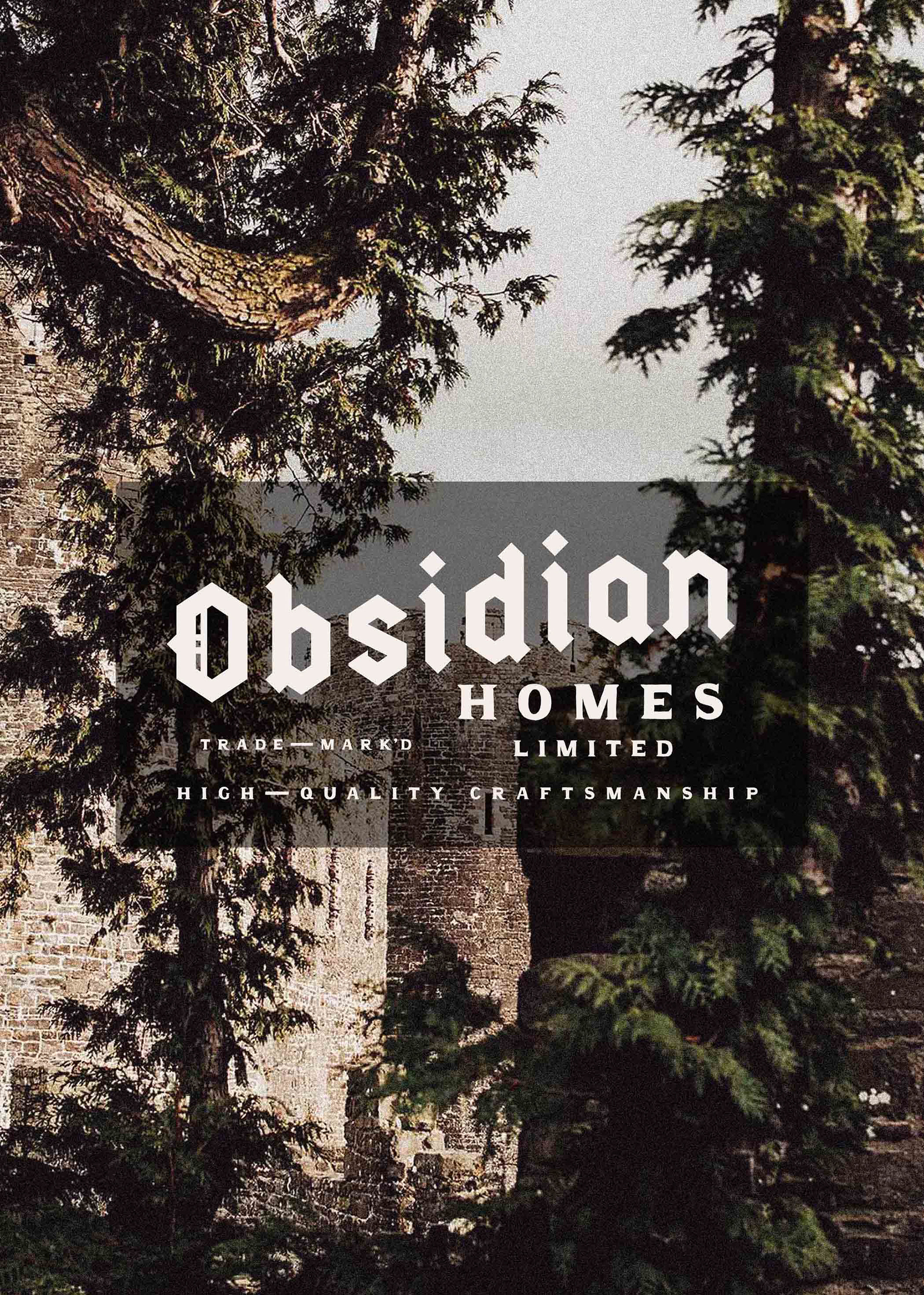
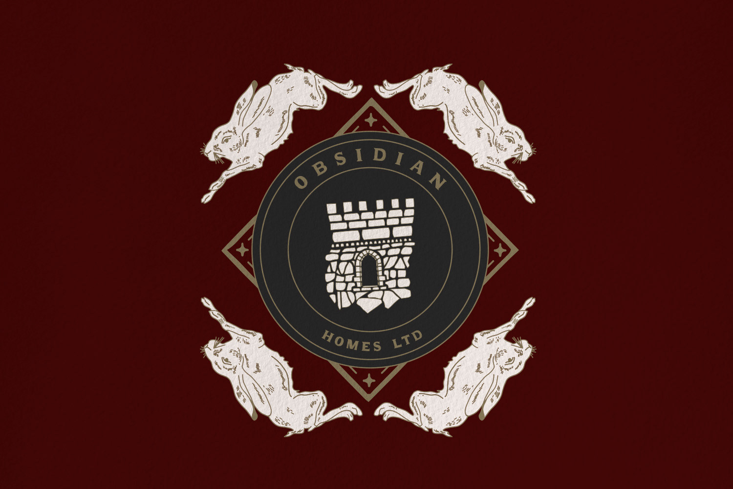
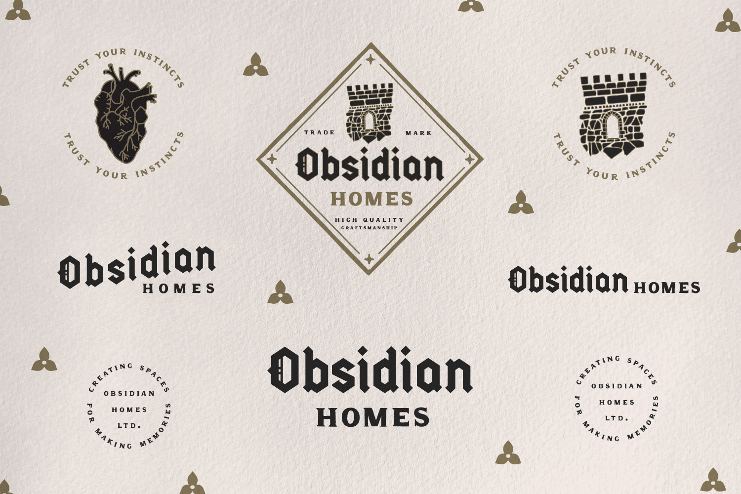
For the Obsidian Homes brand identity, We ended up going for something that has an elegance with a touch of history feel to it. These were ideas that were important to the client.
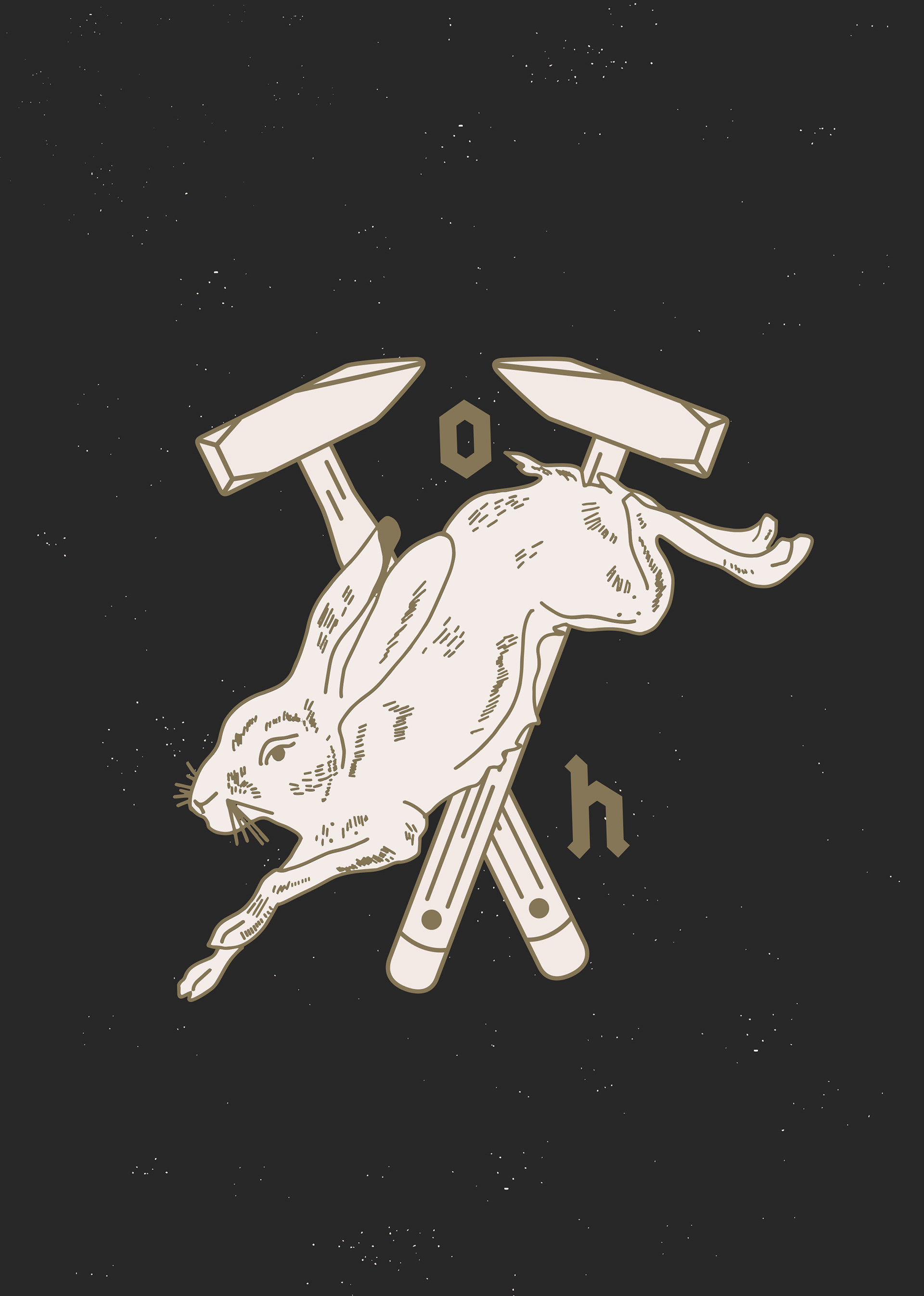
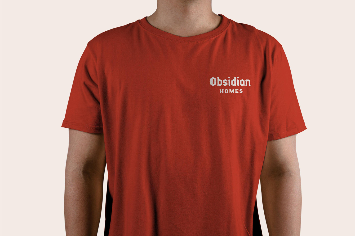
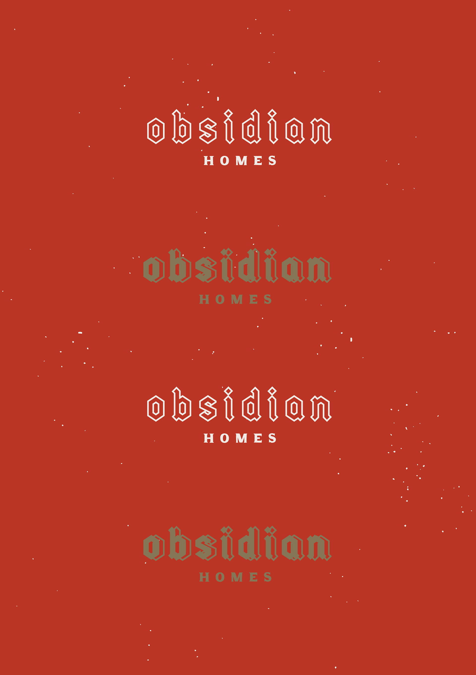
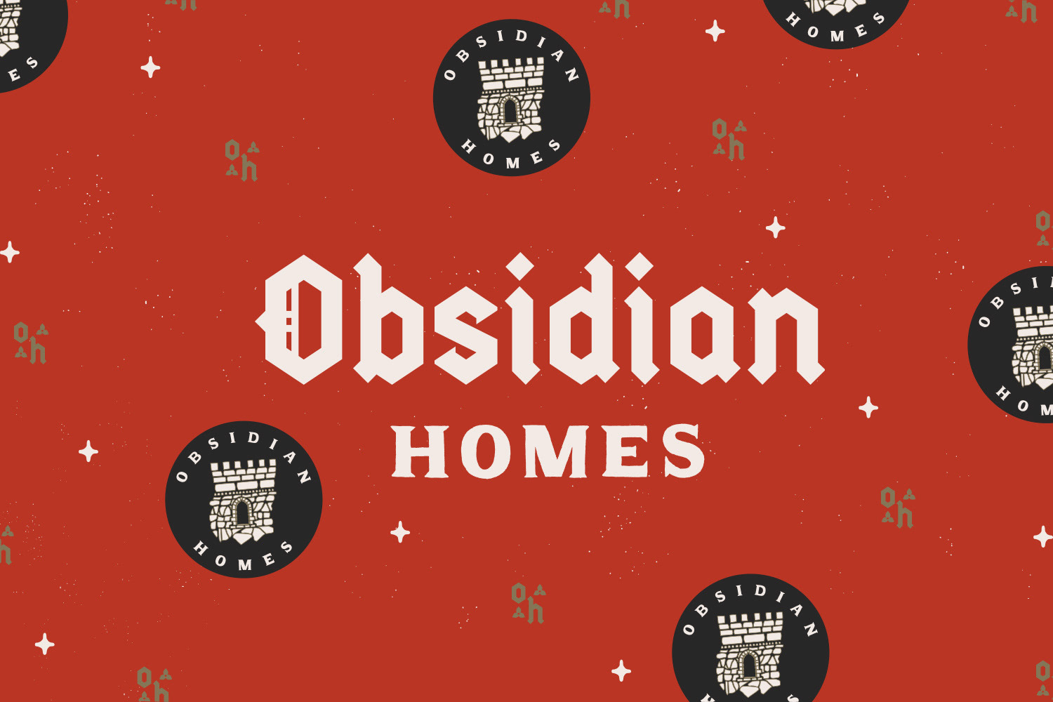
The castle imagery depicts their permanence and long lasting importance in their community. The typography was chosen because it has a modern take on a historical blackletter style font. Showing without telling, how they look to tradition within their trade and skills.
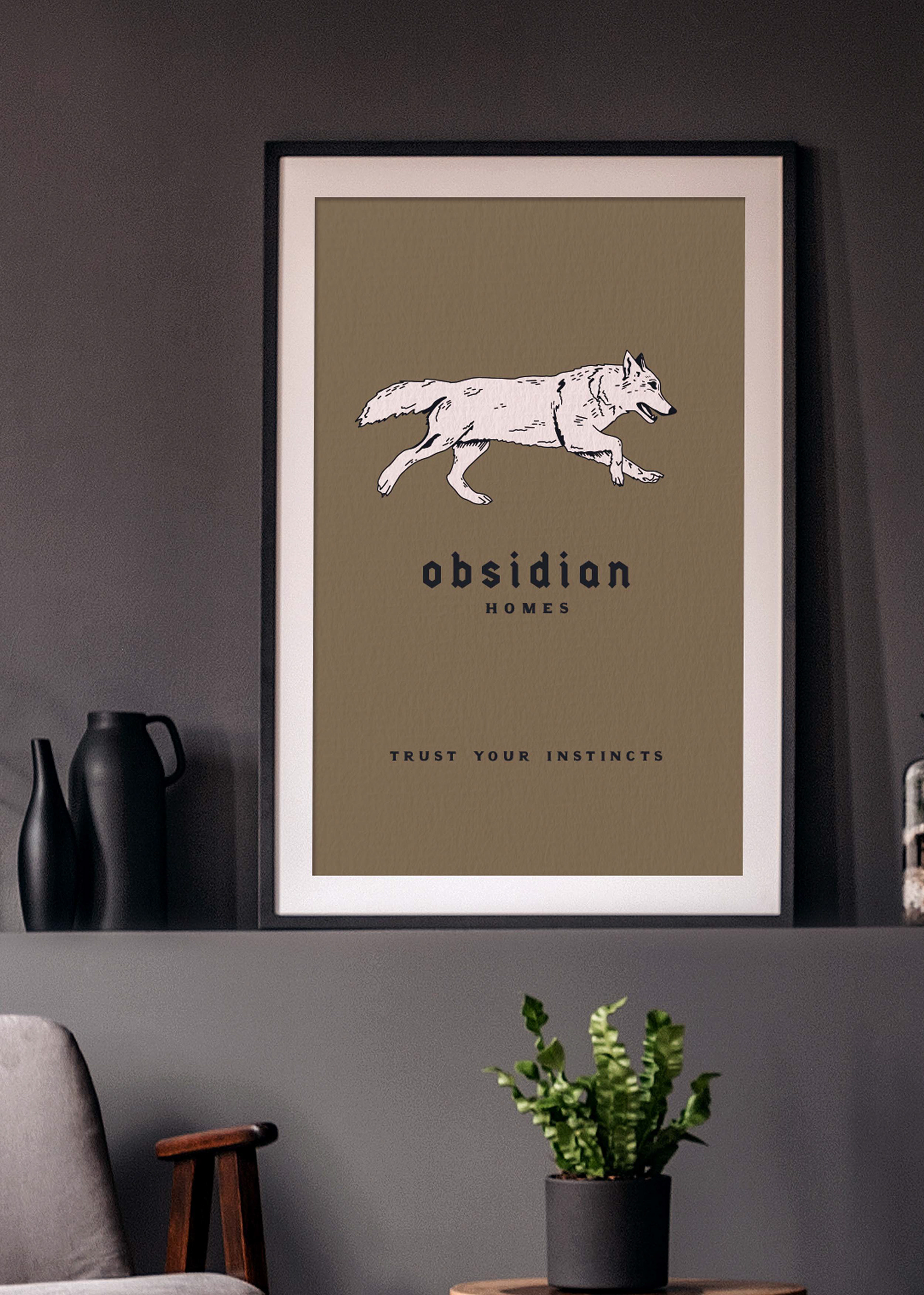
Yet with all of that historical feel, they aren’t stuck in the past. They know how to be relatable, with young and fresh creative ideas. They are innovative and have a high quality craftsmanship that's timeless. Allowing them to really collaborate with their dream clients to create their dream home.